Maneo is a clinical skincare brand that offers science-backed products that target specific skin issues such as: acne, aging, and hydration, blending high-quality with accessibility.

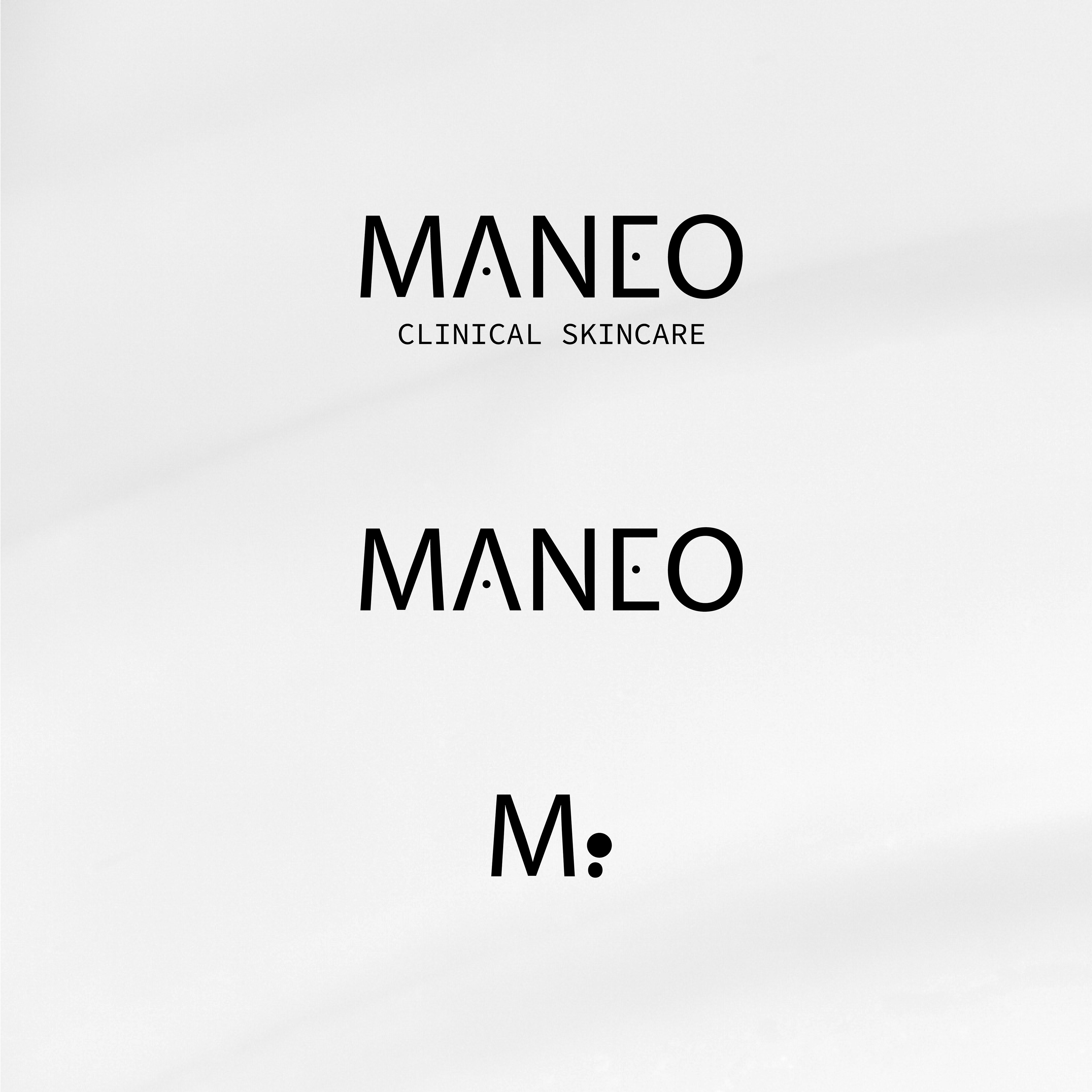

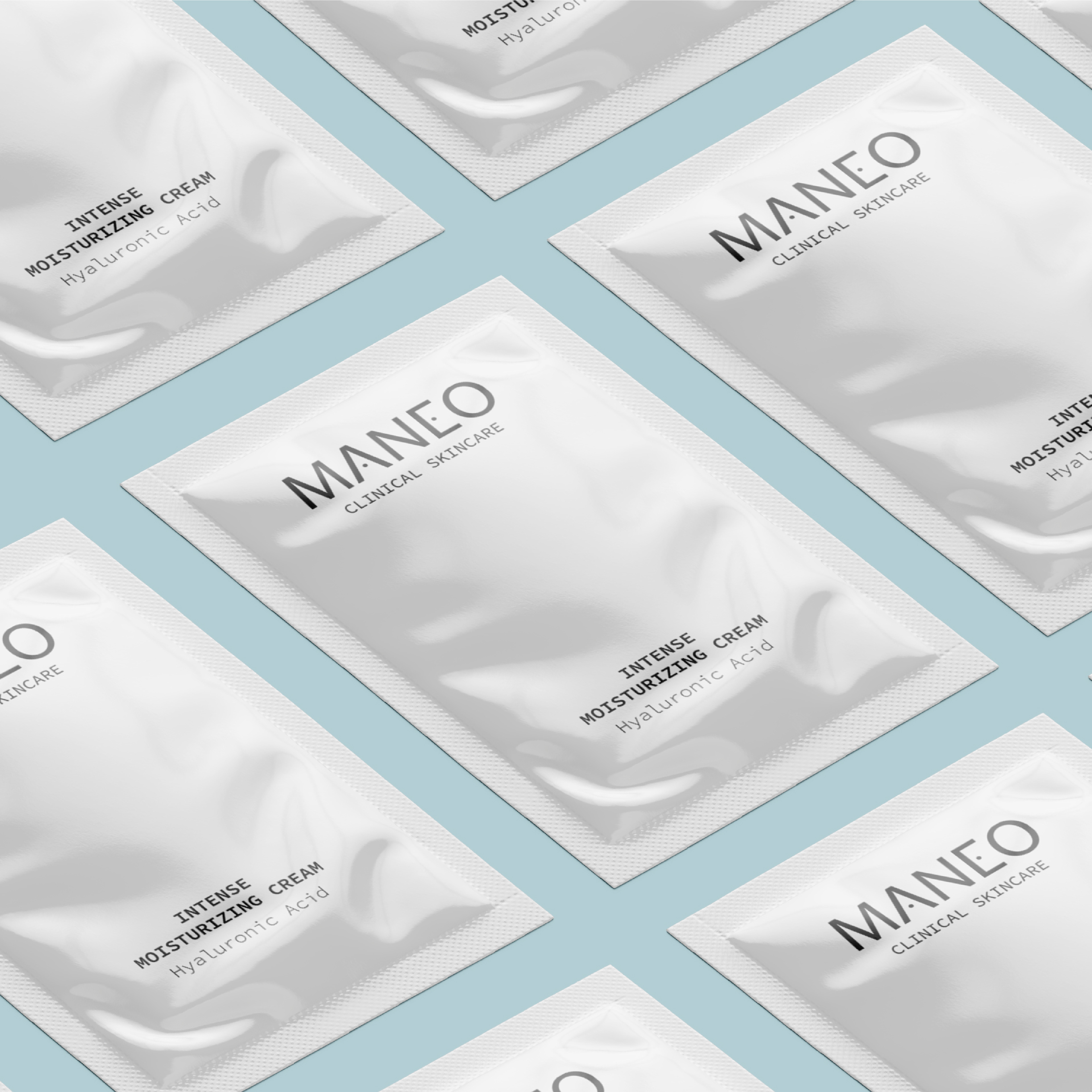
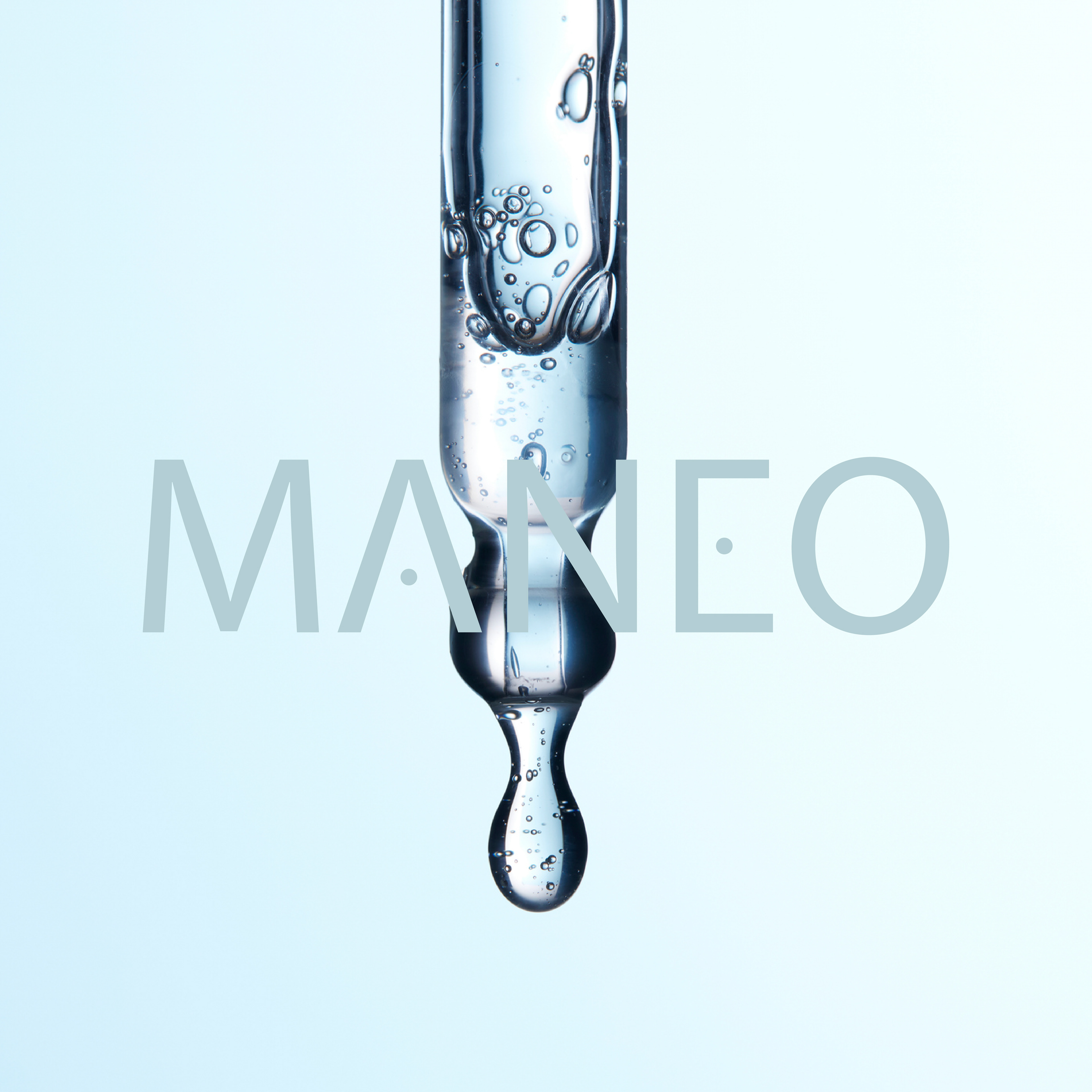
A clinical and rigorous aesthetic, driven by a typography with rectangular forms that embodies the brand’s precision. The circles replacing the crossbars of the letters "A" and "E" evoke the scientific world, a nod to microscope lenses, a symbol of precision in the targeted treatment of skin problems.
The technical and minimalist "Clinical Skincare" baseline reinforces the brand’s scientific approach.
The technical and minimalist "Clinical Skincare" baseline reinforces the brand’s scientific approach.
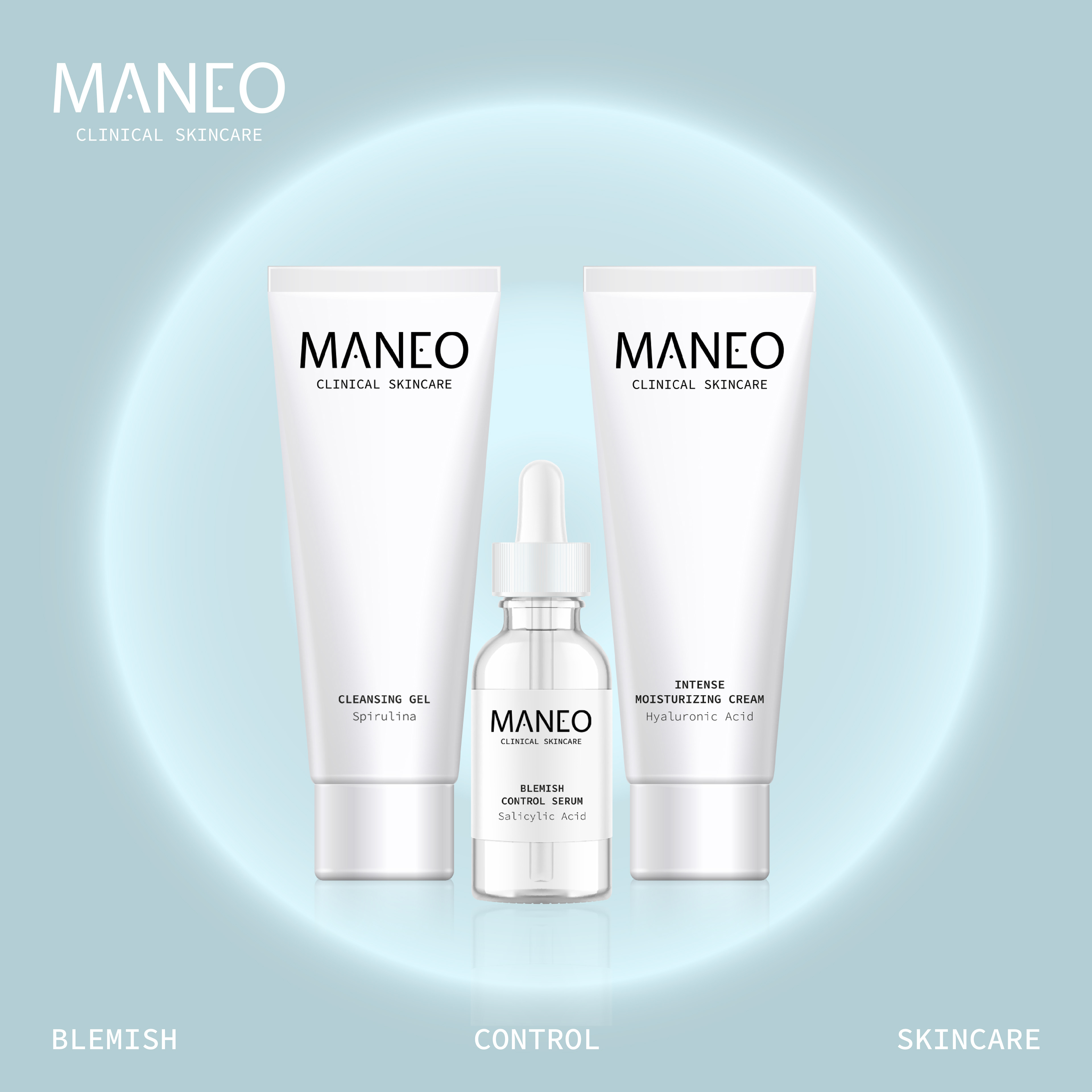

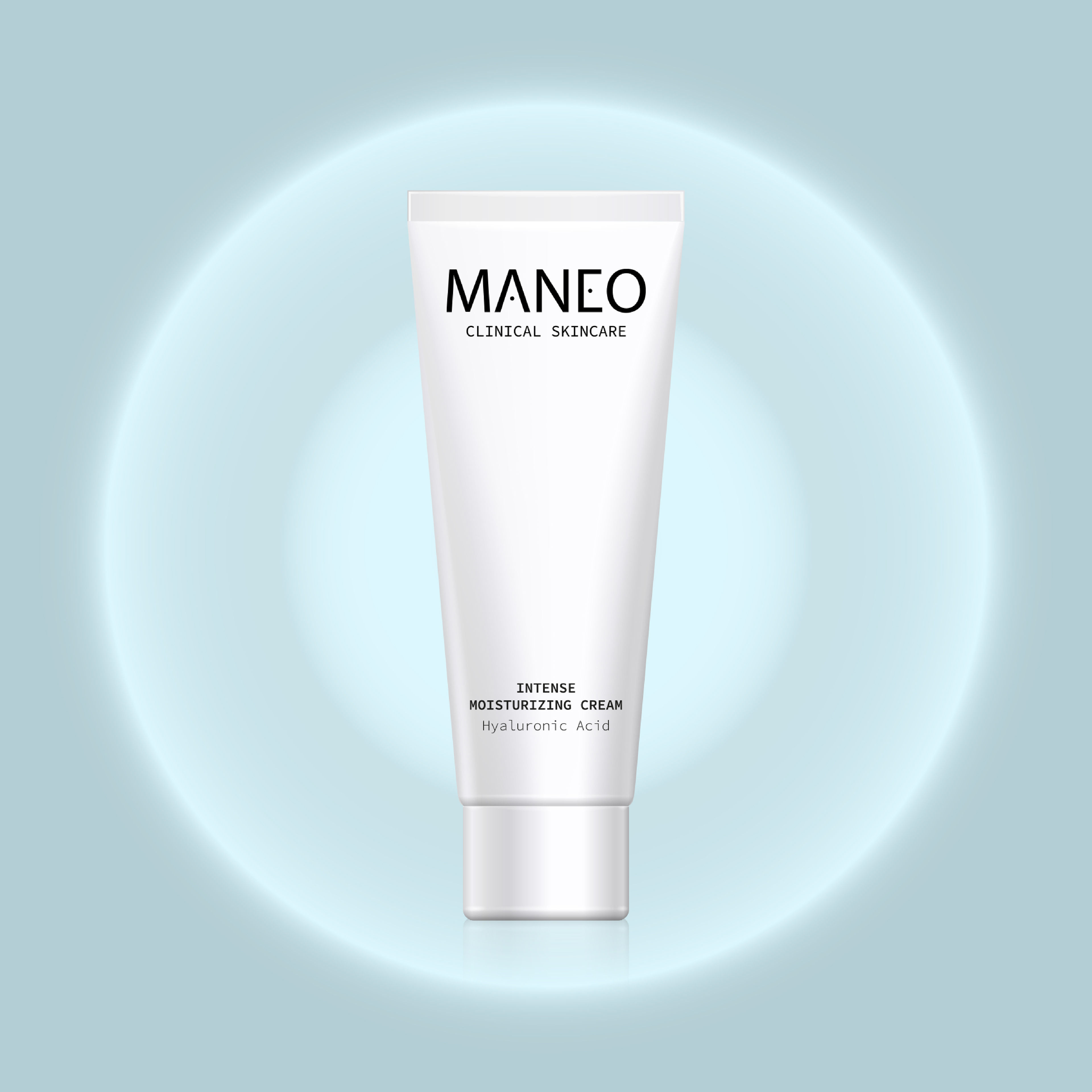
A palette of grays and shades of blue anchors the design in cool tones, true to the conventions of clinical skincare. The luminous circle on the visuals reinforces this idea of precision and echoes the radiance that Maneo products restore to the skin.



Software: Adobe Photoshop, Adobe Illustrator