VELVET
Identité visuelle & Packaging
Identité visuelle & Packaging
Velvet is a charming and sophisticated ice cream shop that specializes in artisanal ice cream made from the freshest ingredients. With a focus on pure, natural flavors and a commitment to quality, Velvet offers a luxurious ice cream experience without any artificial additives.
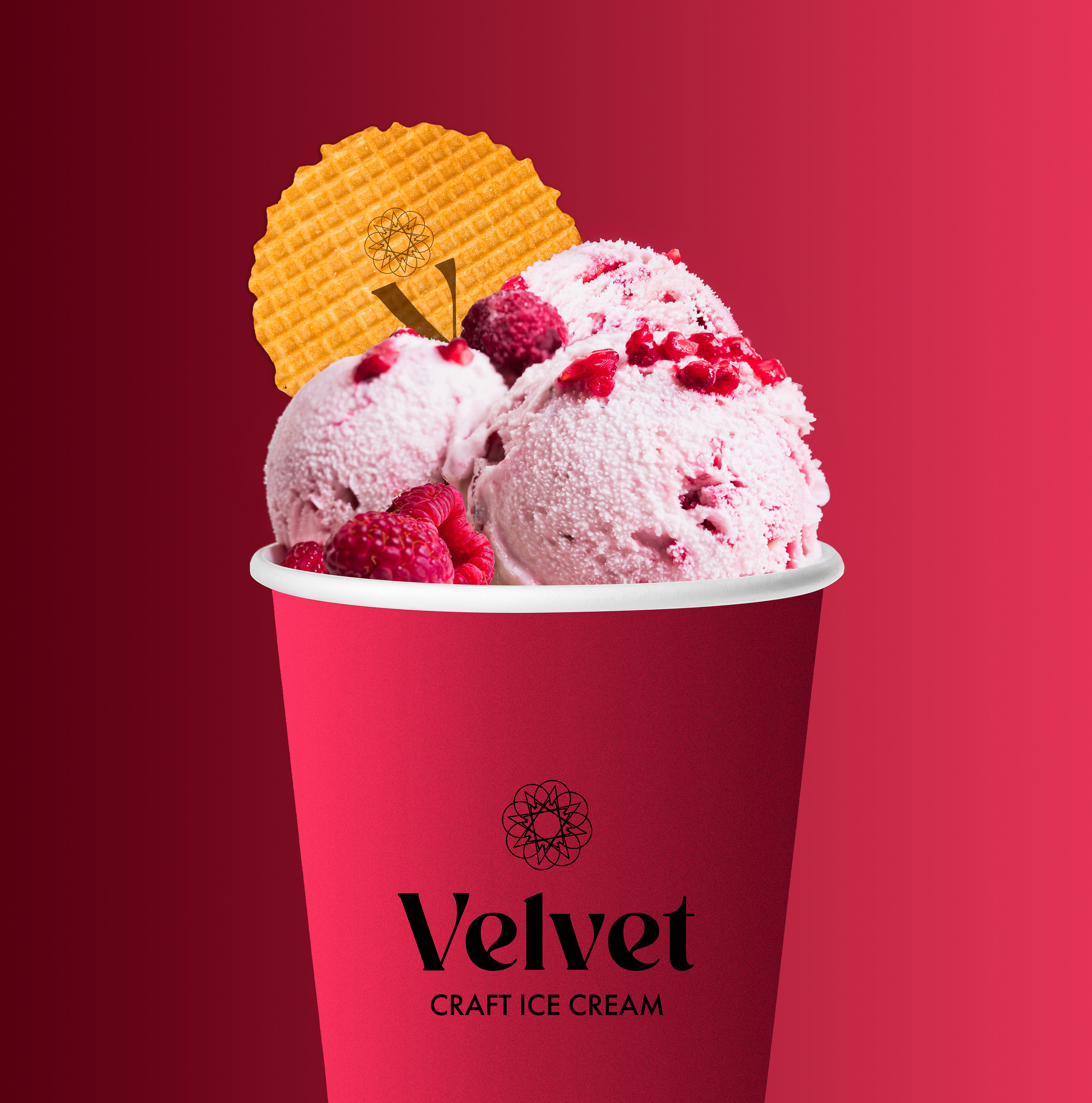
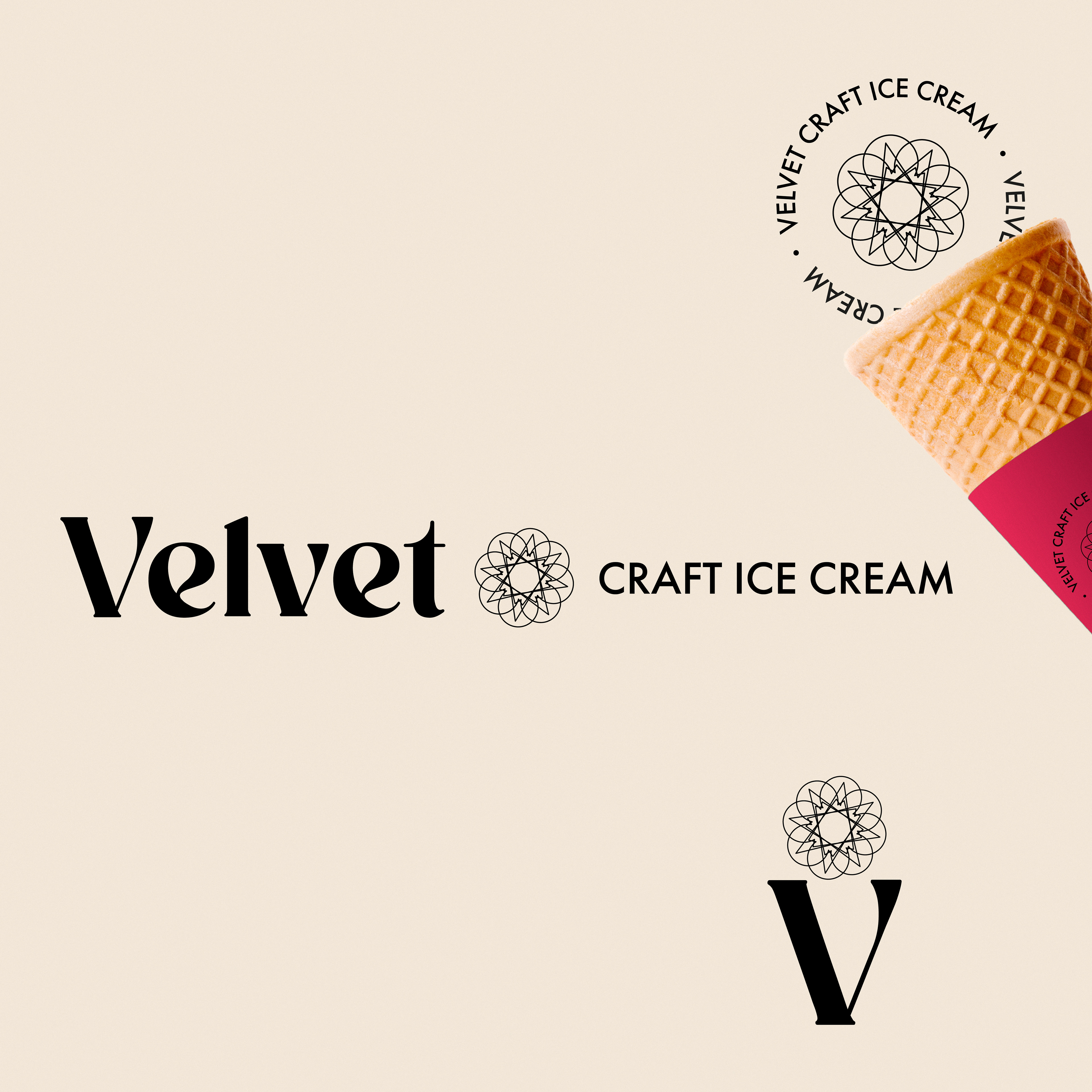
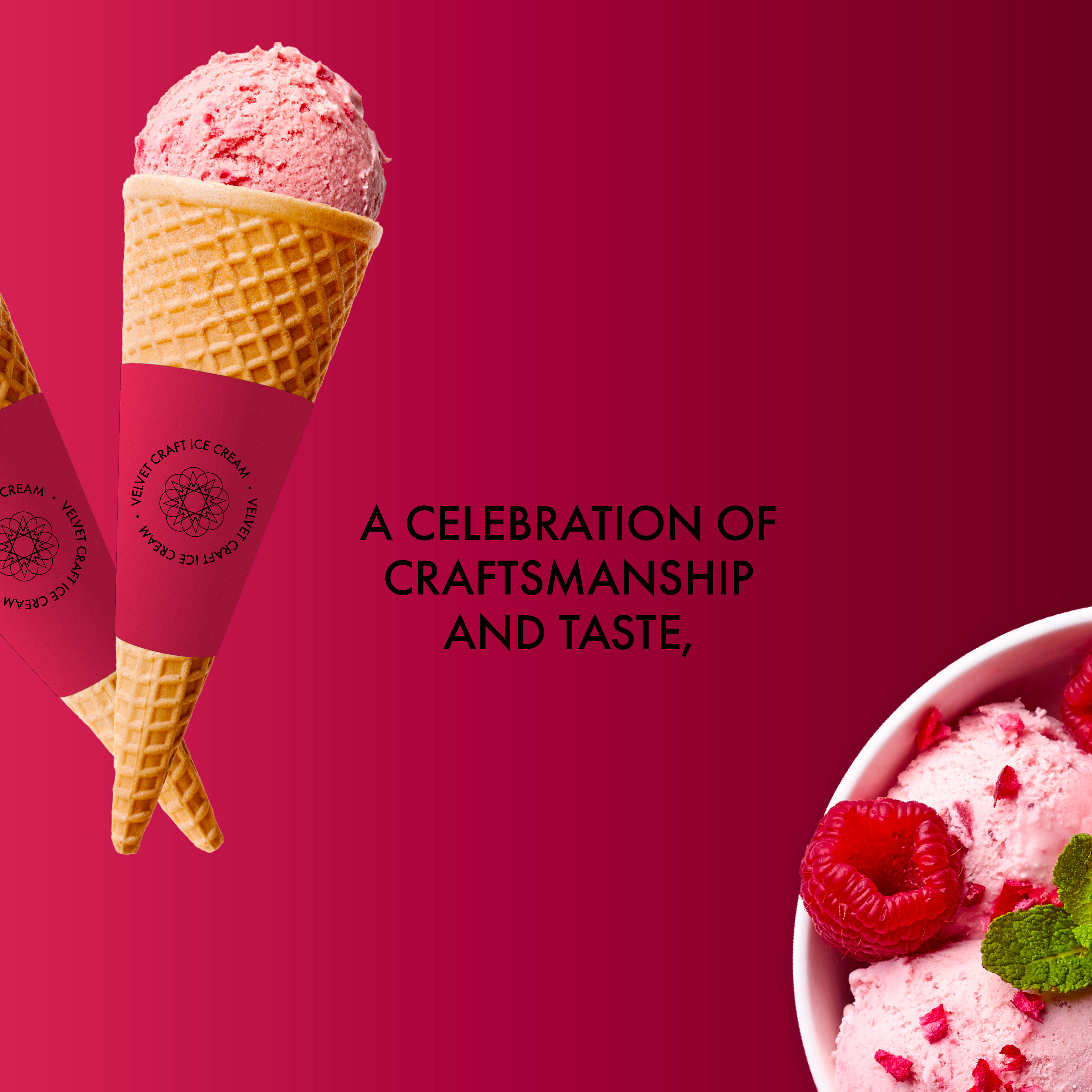
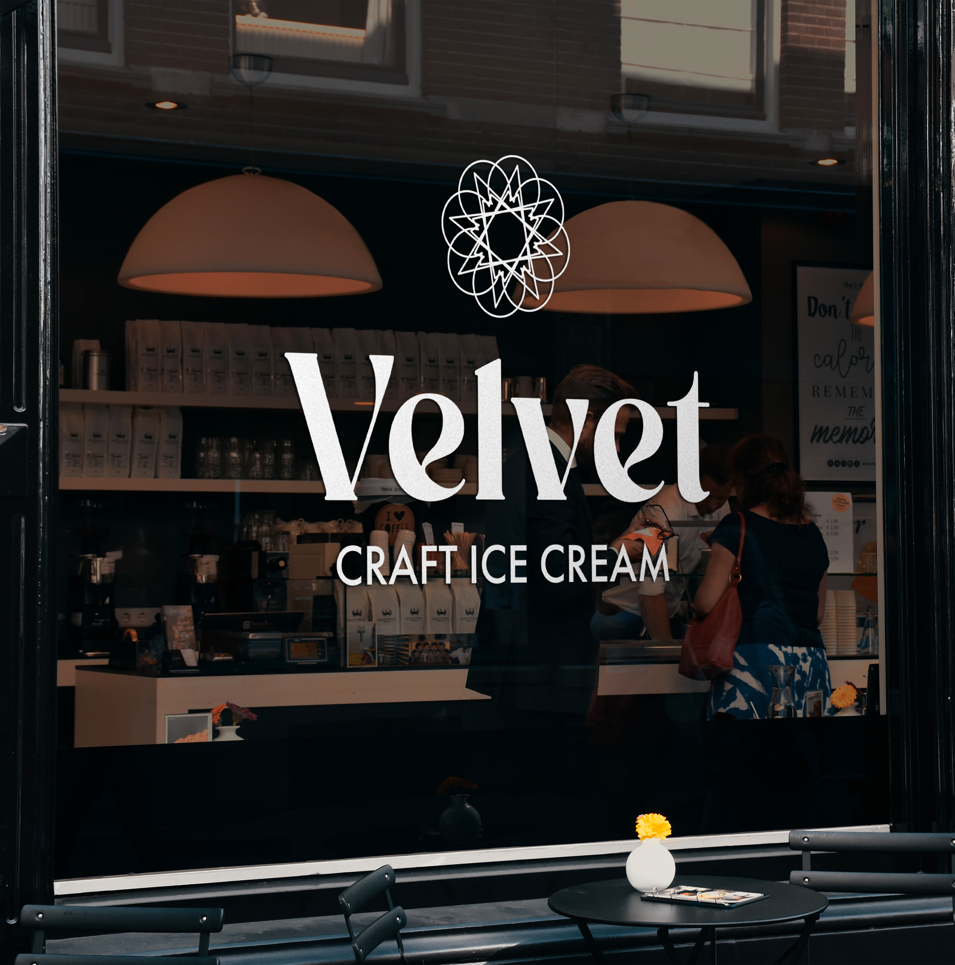
Every scoop at Velvet is a celebration of craftsmanship and taste, perfect for those who appreciate the finer things in life. The main font of the logo is characterized by a striking contrast between thick and thin strokes, reflecting both the creaminess and the refinement of the ice cream.
The baseline font creates a subtle contrast thanks to its geometric structure, providing legibility and clarity that reinforce the brand’s message.
The baseline font creates a subtle contrast thanks to its geometric structure, providing legibility and clarity that reinforce the brand’s message.
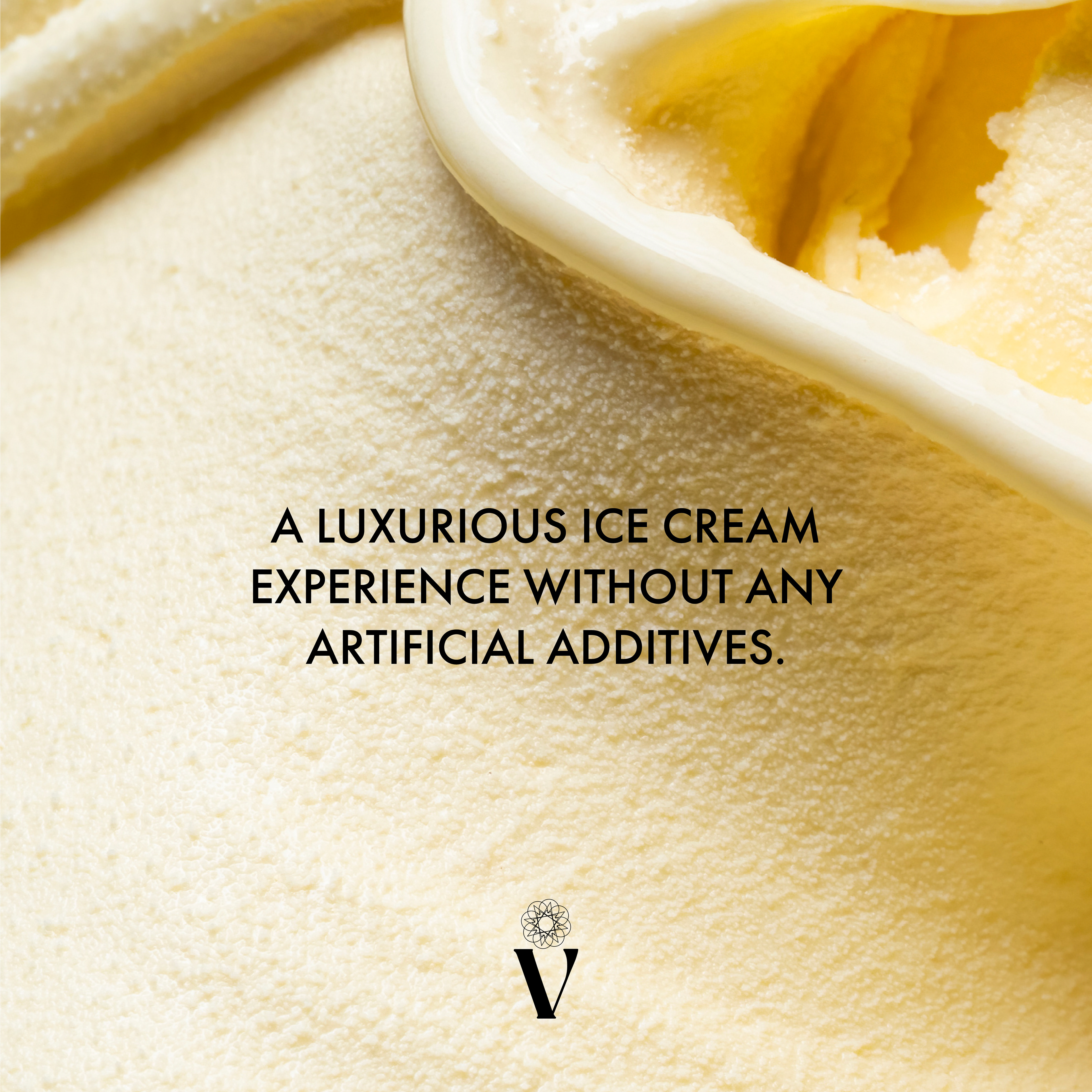
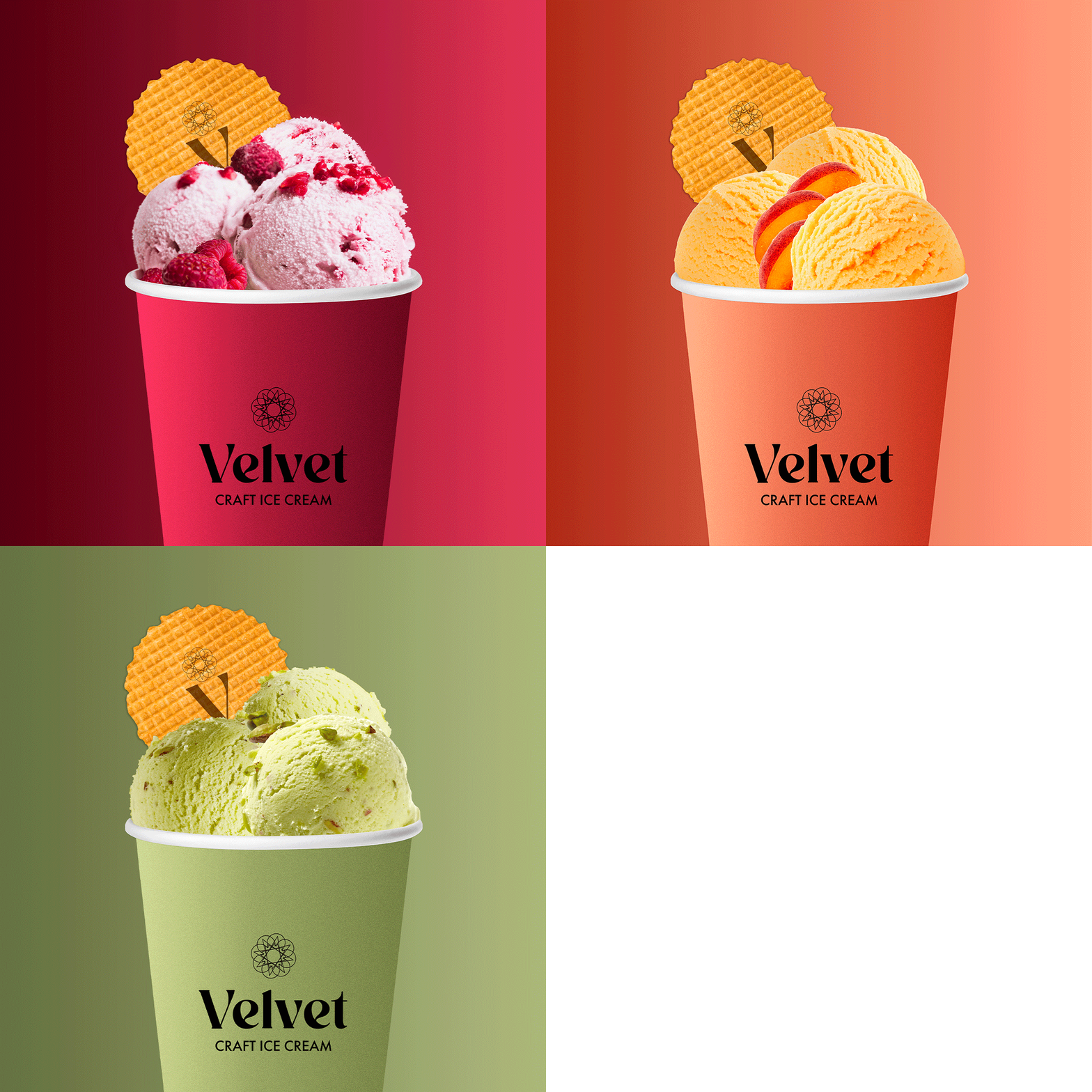
The Velvet symbol inspired by the repetition of an ice cream cone, evokes an explosion of flavors that unfolds into a delicate flower. This refined shape symbolizes the elegance and subtlety of artisanal ice cream, reminiscent of a precious jewel. It also suggests that the scoops of ice cream are carefully arranged in a case, reinforcing the idea of an exceptional product.
Software: Adobe Photoshop, Adobe Illustrator